AllisonJJ
Highest Rated Comments
AllisonJJ6 karma
My answer:
I've always been fairly experimental both in fonts and games. A lot of what I do has been the result of playing with metrics and shapes (for fonts) or mechanics and graphical styles (for games). It's extremely rare that I end up with something I've made that is even remotely close to where I started off with it.
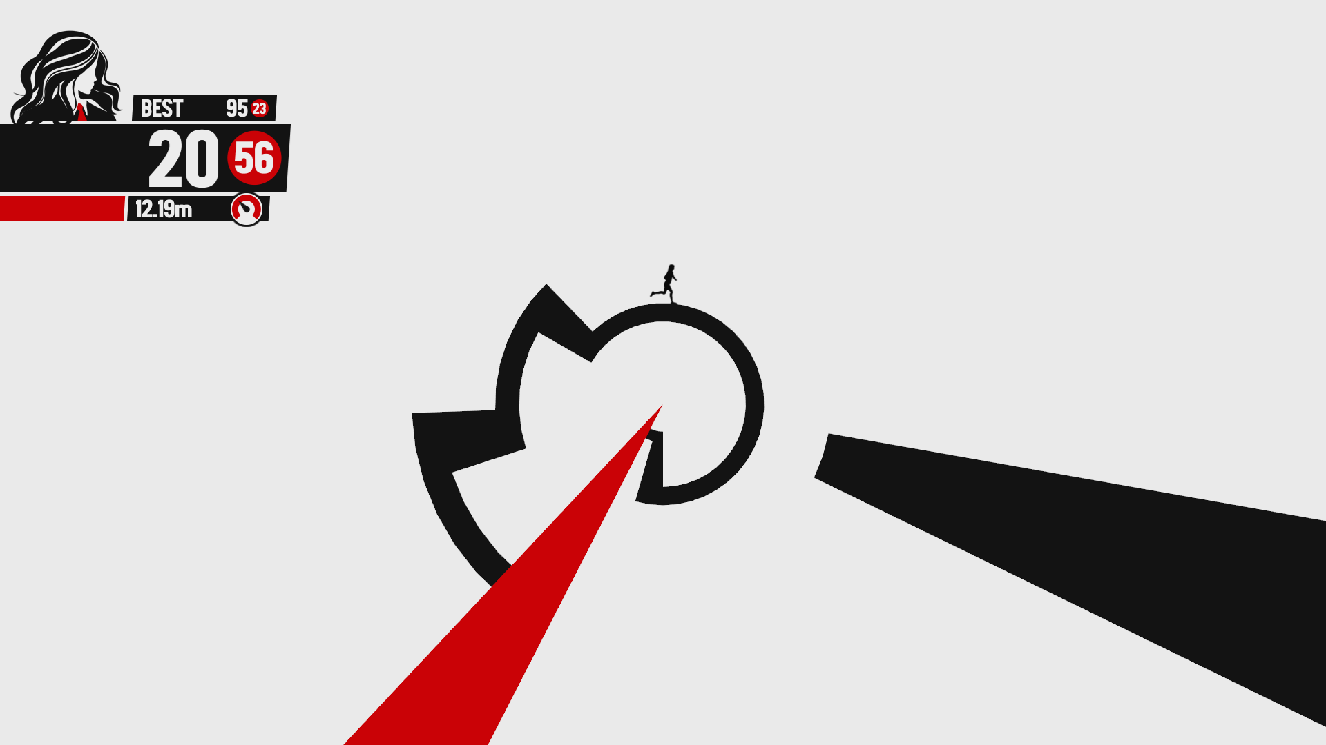
For example, my most popular game series, Maddening, was born out of sheer ineptitude. I was trying to make a game in which you run up a tower, akin to Nebulus and one level from Mickey's Wild Adventure. Completely failing to program that instead produced Maddening's circular effect (https://img.itch.zone/aW1hZ2UvNDA0NDkvMTgwMjU3LnBuZw==/original/VbL2q8.png) that actually ended up working in its favour.
Some other games started as homages (eg Ne Touchez Pas being openly inspired by Messhof's Flywrench) and ended up through sequels being warped more into their own thing.
Some fonts follow that too - being inspired by an existing logo - but most again are just me playing around until I like something I see, and then trusting my eye until it's done. Most of my font work falls into that category, such as Vermin Vibes!
Dan's answer:
It depends what mood I'm in for fonts. I normally have the end result in my head when I start, or the product I'm aiming it for (such as Organic Teabags - which I made specifically because I could see it being used on packaging for that). I definitely prioritise making fonts that I believe people could specifically use (Allie doesn't always do this!). My font previews often reflect how I'd see them being used, for example Somerton Dense being previewed on a pub sign.
That is admittedly a fairly business-heavy answer, but I do also appreciate the challenge of trying to make something that fits a particular brief!
In terms of games, character design is my favourite part. I take a lot of inspiration from nature - for example, Gyro Boss' firebrats and squids are based on real animals. Flore Ibrida, Squid Poker, Thysanura, Super Plush Festival and tons of my other games all feature animals heavily.
In terms of influence from other designers, I'm a huge Nintendo fanboy and have always enjoyed series like Mario, Legend of Zelda and Pokemon. I guess you could say the "feel" of my games is inspired by them. I want things to be lighthearted with memorable characters and fun mechanics, but none of my work is directly based on them or even very similar in terms of mechanics.
Tl;dr: experimentation, life preferences, and end goals!
AllisonJJ6 karma
We're okay, promise! 😄 For me especially (I am behind over 700 of the fonts and 140 of the games), I've always erred on the side of instant gratification. I've got a few fonts that took a while, a couple of games that took months or even a year or so to make, and one game project I've been working on for nearly four years now, but I've got an experimental game style and an "optimised" font style that means my production rate is far higher than the average, even though the results are often smaller or simpler than other people's counterparts.
Dan is the same, just to a slightly lesser degree - he'll go about things more methodically, with more planning and overall effort. I wing things a lot!
...blinks
AllisonJJ6 karma
We use a couple. I started off in 2005 using High-Logic's FontCreator, and made a few things casually off and on with it (that never really got anywhere online). I discovered the free modular site Fontstruct.com in 2011, which got me into making fonts as a more serious venture, then learnt how to use FontCreator properly in 2013 to expand my abilities. The vast majority of our modern fonts are made in FontCreator nowadays, although we do both still occasionally drop back into Fontstruct for certain styles (it's excellent for bitmap fonts).
No, to date we haven't. It's quite difficult to trace whether people have paid, since a lot of higher end commercial ventures will be using a design studio as a "middleman" which will be the ones that license the font from us. Not to mention, lawsuits are expensive!
Rockstar have used a couple of our fonts in packs for Grand Theft Auto Online. From memory, the Juggernaut) expansion used Sheeping Dogs and another expansion I can't immediately bring to mind used Toe the Lineless.
AllisonJJ3 karma
Fonts can vary in timescale depending on style, expansiveness of its support etc. I can do simpler fonts that only really support basic English characters in a couple of hours. Unique styles might add a couple of hours, a more thorough kerning pass adds time (I always do a basic one to ensure the most troublesome pairings look okay), as does extending the font's support to European characters (accents, circumflexes, diaereses, diphthongs etc) and occasionally even beyond that into Greek, Cyrillic and Hebrew.
My most extensive fonts - for example, Queen of Clubs - have run into a week or two of work, which is still a fraction of the best of the best, but I'm nonetheless extremely proud of the result. Dan always supports full European characters, so his take longer on average than mine do.
As for motivation, there are a fair few factors. Perhaps predominantly nowadays is simply money - this is our full time job now, so we keep to a Monday to Friday 9am-5pm schedule and ensure we keep ourselves productive.
But there is definitely still a love we both have of what we do. Most of our games make a fraction of our fonts, but we just love being able to make a thing we can play, and seeing other people enjoy what we make.
And as for fonts - seeing other people, especially people we recognise - use them is an incredible and surreal feeling. Kurt Angle, one of my childhood heroes, once Angle slammed Cesaro while Cesaro had my font work on his trunks in an episode of WWE, and that breaks my brain in a way I've never felt before! And that's one of many examples - I've also got a font in a music video with 994 million views on YouTube (Ariana Grande & Zedd - Break Free) and that is a number I am completely unable to comprehend.
It's an extremely silent artform, garnering us little to no personal attention, but seeing examples like those and knowing I had the tiniest hand in them is a huge driving factor to me continuing to make fonts.
AllisonJJ9 karma
We try to keep a steady stream of fonts going, since they provide a fair portion of our income. Normally that will be me - I have made over 700 of our 900 fonts, and they've always predominantly been my thing. Dan does them because of how I've done with them!
But sometimes if I'm particularly deep in the development of a game, Dan might cover for me on fonts to keep us releasing steadily and remaining as visible as we can be on font and design sites.
View HistoryShare Link